Problem & brief
The client wanted a distinctive bird logo that stands out on products, marketing, and digital platforms. Key goals: premium look, legibility at small sizes, and a flexible design for multiple applications.
My approach
Started with sketches of bird silhouettes and wing shapes. Explored brown-gold gradients and textures in Photoshop, then refined the chosen concept in Illustrator for crisp vector output.
Logo explanation
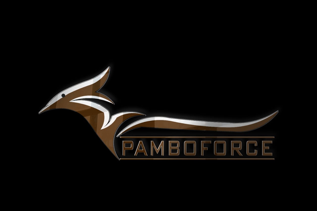
Symbol: a stylized bird with geometric wings ensures recognition and scalability. Gradient adds depth and richness.
Wordmark: bold, clean type complements the bird icon and balances visual weight.
Color: brown-gold primary (#B8860B) with darker shades for contrast.
- Primary and secondary logos (SVG, EPS, PNG)
- Monochrome and gradient-ready marks
- Color palette and typography guide
- Application mockups (labels, signage, social tiles)
Color palette
UI experience & applications
The logo adapts to websites, social media, and merchandise. Components maintain a premium look, using gold accents sparingly for CTAs.
Accessibility & responsiveness
Tested contrast for small and large formats. Supports monochrome printing, foiling, and digital use.
Files & handover
All final assets are included in a delivery folder: /Pamboforce_Bird_Final/ with vector masters, PNG exports, brand guide, and mockups.